
MIDDLE E.
SERIES OF PRINTS
COMMISSIONED BY
WHITWORTH GALLERY, UK
THEME: POLITICS;
CIVIL RIGHTS
A series of screen-printed works of the letter ‘E’ that has absorbed the spirit of a beaten and murderous Middle East →
This work was commissioned by the Letterspace project which culminated in an exhibition of 26 letterforms, the full alphabet, displayed at the Whitworth Art Gallery and throughout Manchester city centre → The project involved 26 designers, each worked on one letter of the alphabet → The letter is informed by or found within the designer’s everyday spaces → This might be their home, their street, their city or area → the emphasis is on the connection between the letterform and the place →

I chose the letter E intuitively, as it is the first letter of my surname, Ezer (Means 'helping' in Hebrew) → A surname is a sociopolitical means of cataloguing the individual within and towards the social and cultural space → The fact that the E is also the beginning of the word East, which in itself is a means of geopolitical cataloguing, also fascinated me → In this way what began as a personal utterance quickly became a reflection of a ‘place’, a loosely-defined, amorphous, almost borderless geographical region → A place that arouses in me contradictory, paradoxical feelings of strangeness and intimacy → My middle E in the Middle East: My Middle E-ast →
The E is not (just) a letter; it is an entity, a mood, it is a sponge that has absorbed the spirit of the times → It is the soul of the Middle East, ‘photographed’ at a particular moment → It is my Middle East, that of my ancestors, of my family → But now it is battered, burnt, beaten, disintegrated, suspecting, hating, murderous → Hell is only a few hours’ drive away → Russia and America, Iran and Turkey, what remains of ‘Iraq’ and what remains of ‘Syria’, Kurds, the Islamic State and Hezbollah, Shiites, Sunnites, Alawites, Kurds, Christians and Druze all act in the tragedy that once was called ‘the Arab Spring’... how ironic →
When I began work I printed the letter ‘E’ in Times New Roman, in a ‘functioning’ and ‘intact’ form, and I then folded and creased the paper in order to ‘cripple’ or ‘damage’ it → In its new, battered state, I photographed the letter from several angles, in order to absorb as much visual information as possible → I then placed the layers of the photographed letter on top of one another while reflattening and reuniting them to create the final symbol → The multiple possibilities created in this process are reminiscent of sketched studies, or a process that is frozen in movement, and they made it possible to print a complete series of the different E’s in black and white → The final format is one ‘situation’ from the series, which was printed as a modestly-sized (42 x 59.4 cm) poster using a technique of silk-printing, with a blood-like texture and colour on white paper →
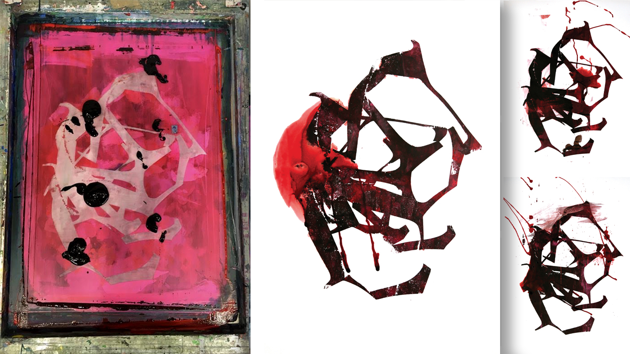
I chose this specific state or ‘position’ because it contained the most visual ‘information’ of the other states → It is an abstract of the general idea: dissonance that represents jarring sounds; the torn oud string of the Middle East today → Thus the E became connected to its place → the place where geography and typography collide powerfully →
Middle E references my early works → my work ‘The Message’ (2001) is a clear point of reference → In this homage to the music of Israeli composer Arie Shapira, I cut, folded and bent parts of letters from the printed surface to visually echo the fragmented energies of the musical pieces → Here (and since then) I used the musical education I received in my youth → Concepts such as harmony and disharmony, tonality and atonality, weight and rhythm are not foreign to the field of typography →
Studies from 2005–2006 such as ‘Temporary Type’ and ‘Tortured Letters’, in which I stretched, pulverised, ‘strangled’ and ‘hanged’ the letters, were also precedents for destructing, dismantling and ‘mutilating’ typographic symbols →
When I am at my best, I engage with the inefficient, the non-functioning, mistakes, and failure → I engage with the unpolished, the non-trendy, that which lacks orientation → I engage with the unreadable, the incomprehensible, the out-of-context, the embarrassing hitch → I engage with these topics in contradiction to my initial instinct as a type designer who aspires to design readable, perfect letters → Fonts that will be an effective, accessible, clear, communicative tool →
When I engage with the art of experimental typography, I am curious to illuminate the lack of communicativeness, the illusions of the struggle for relaxed, flowing human communication → In this way I aim to communicate in an alternative way with the subconscious in an ambiguous emotional and mental space.
